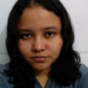
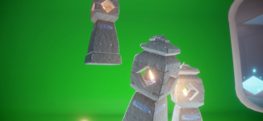
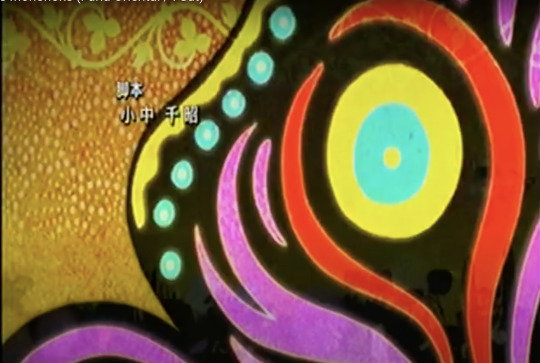
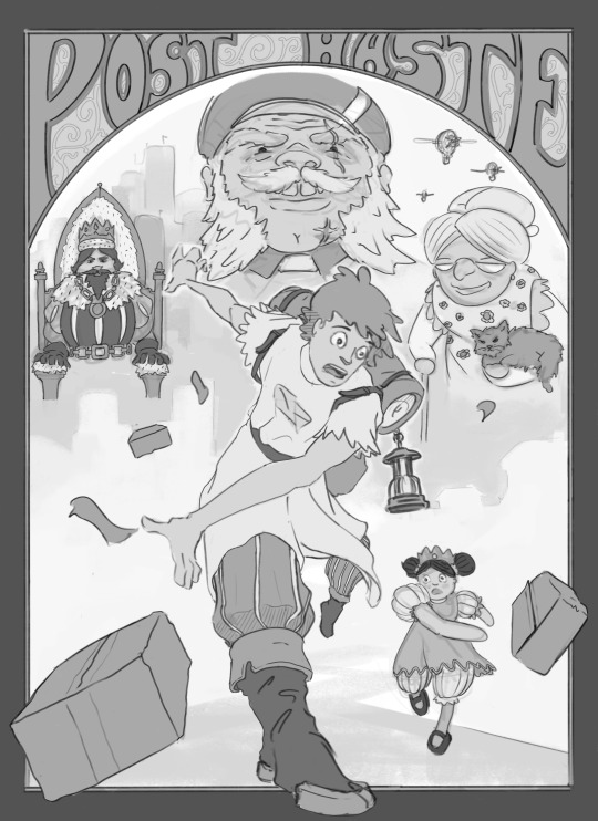
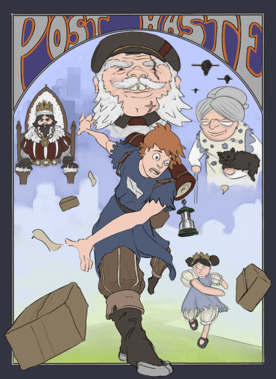
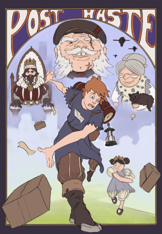
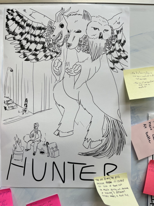
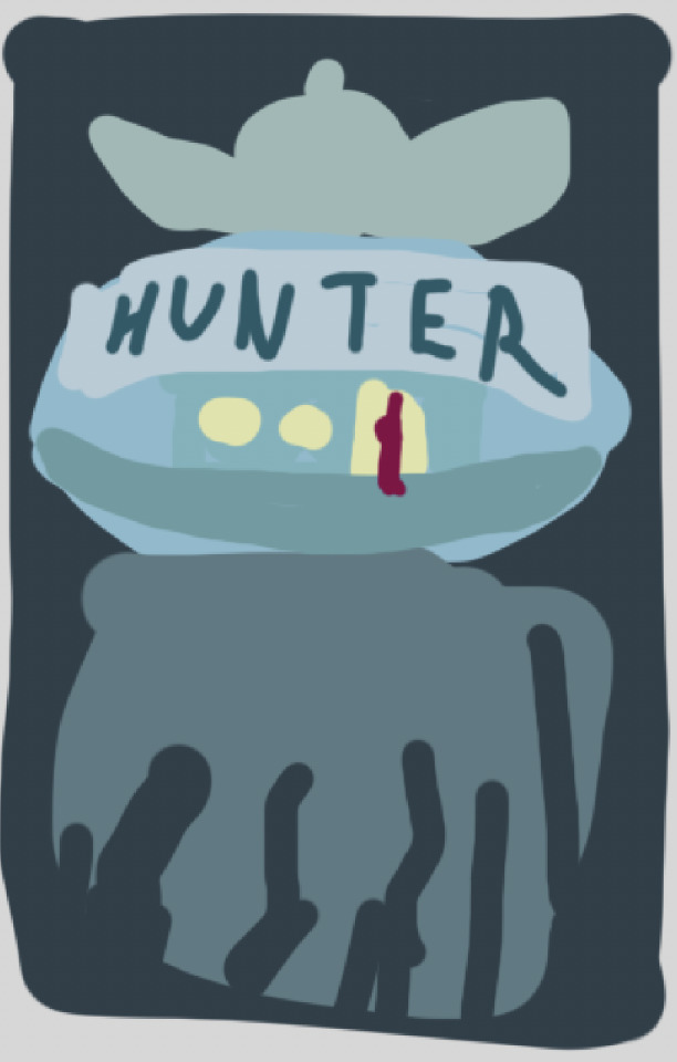
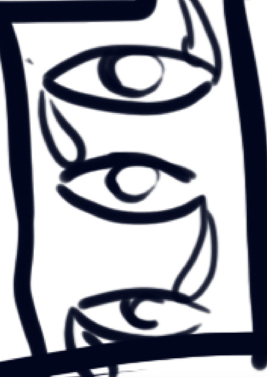
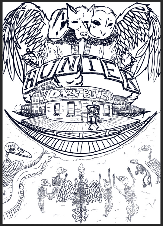
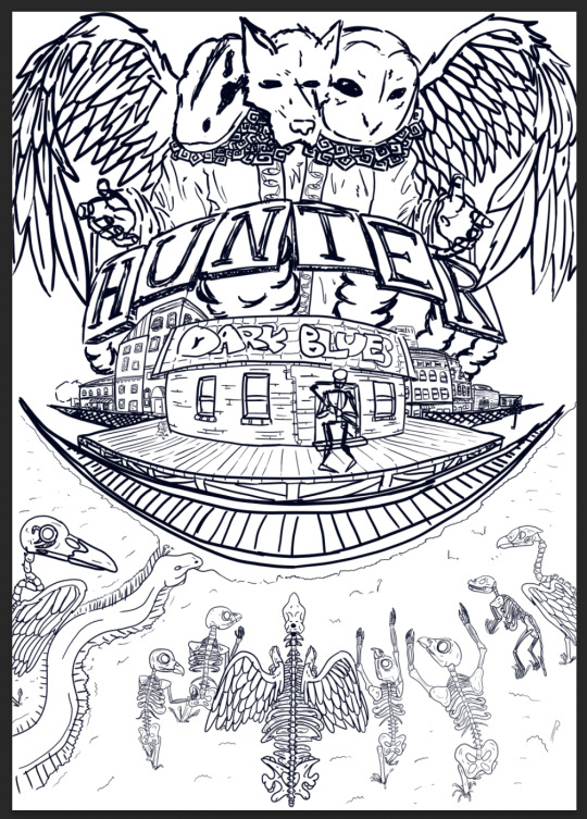
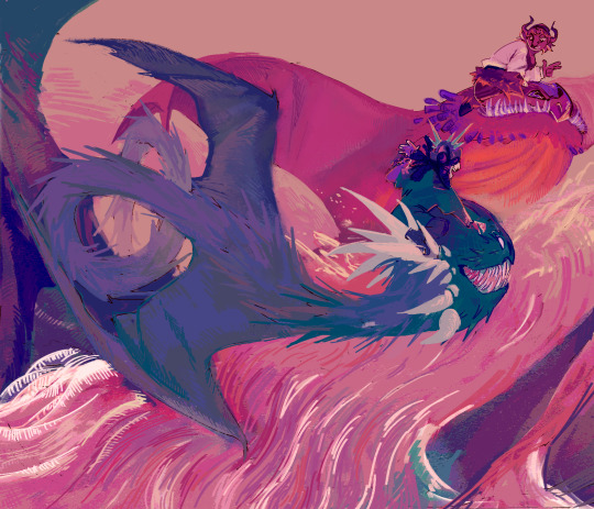
#the finalized poster design i made liked this composition a lot more
Explore tagged Tumblr posts
Visit Tumblr Blog
Explore Tumblr blogs with no restrictions, modern design and the best experience.
Last Seen Tumblr Blogs


Fun Fact
Hackers stole 65M passwords from Tumblr in 2013.
Text
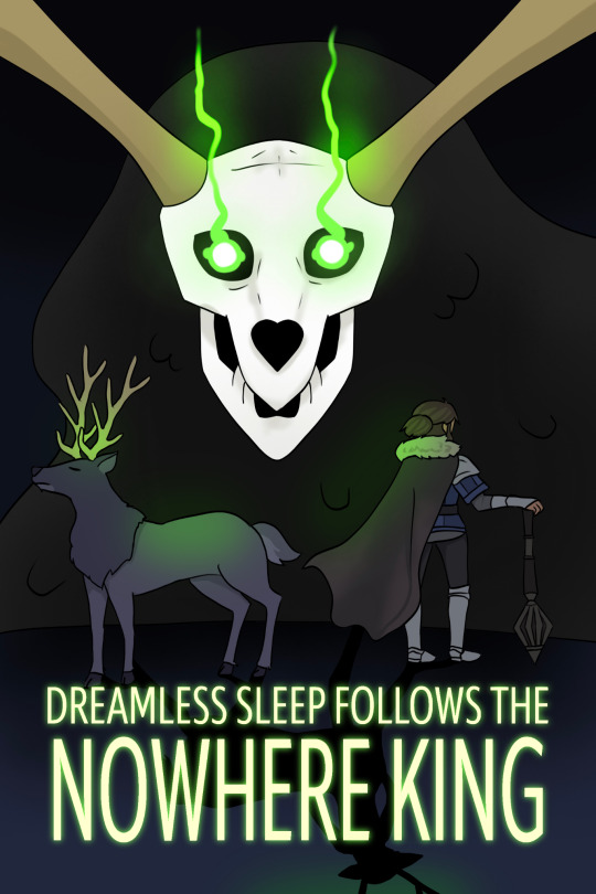
#centaurworld#nowhere king#elktaur#the finalized poster design i made liked this composition a lot more#i also posted the textless version so you can see the whole detail
25 notes
·
View notes
Text

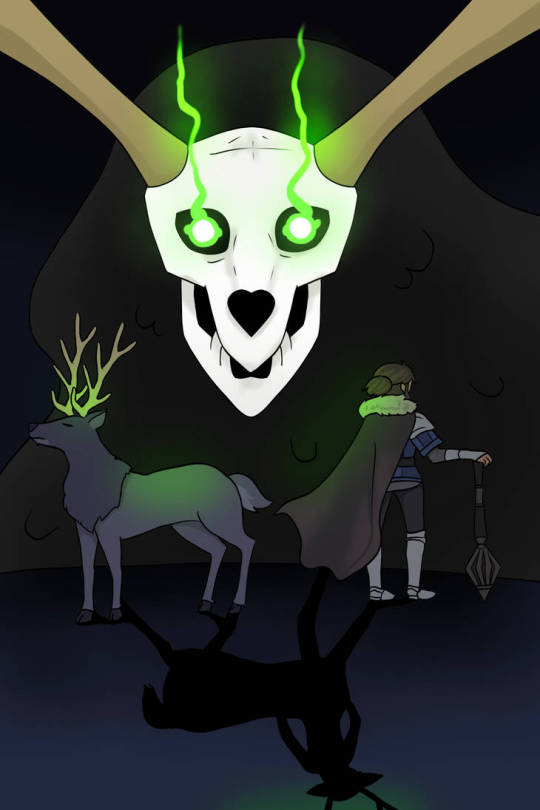
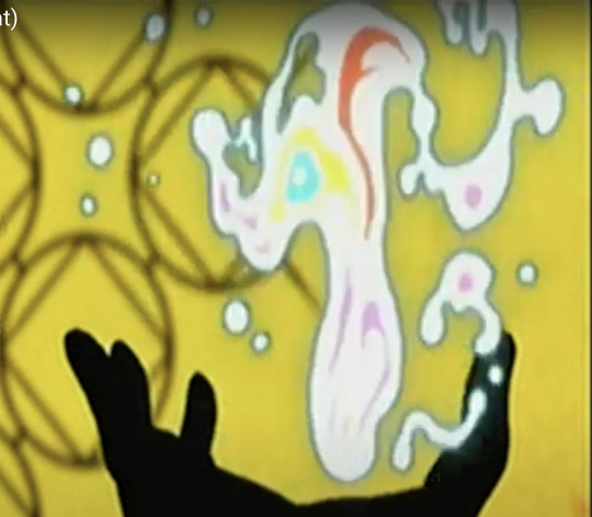
Currently, Sky: Children of the Light and Mononoke are my two favorite things and I so very badly want to will this collaboration into existence. 🕯⚖️
Process GIF & artist commentary below the cut!
This began as a self-indulgent costume design project: aMononoke-inspired Sky cosmetic. It was supposed to be a quick-and-dirty mockup that would not be shared outside of private Discord servers, but I got...carried away.
It came out a lot nicer than anticipated. A bit rough around the edges, but when zoomed out clean enough to look like a legit Sky cosmetic. I extracted the high-res Sky and Mononoke logos from their respective websites. I custom-made the handhold collaboration icon. Then I slapped it on top of the costume design. It looked neat!

But then I started having second thoughts. The outfit was quite complex, and it didn't feel right to have it sit in a sterile, empty space like that. It looked half-baked, incomplete. So I used the Mononoke movie poster as inspiration for set dressing and color palette:
There are vestiges of the project's origins scattered throughout this piece - namely that a lot of the visuals were built upon screenshots from Sky. Since it was a costume design project, I didn't feel the need to draw from scratch. They were completely painted over in the final product, but using this technique sped up my process quite significantly!
I went to the Sky Wiki for references. I cobbled together some Season of Revival's kimono cosmetic as a starting point for the outfit. The eyeliner detail Days of Style mask looked similar to the Medicine Seller's face markings, so did a quick photoshoot in the Office to match the camera angle of the previous image.
For the lantern, I made a shared memory in the green room to get the ideal camera angles for each of them:
The grave markers I referenced from a photoshoot in the Hidden Forest's hub:

And the bridge I took from the Sunny Forest:

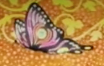
The butterflies were a last-minute addition - I wanted something to make the composition more sparkly! Then I remembered the end credits of Mononoke had a butterfly too! I figured since I went with the Medicine Seller's new design, this would be a nice homage to his classic look.
#モノノ怪#mononoke 2024#mononoke 2007#kusuriuri#medicine seller#thatskygame#sky cotl#sky children of the light#thatgamecompany#thatskygame fanart#sky cotl fanart#crossover#purplealmonds#2023#🔕
926 notes
·
View notes
Text

My Art Summary for 2023! Template made by ArielDrawsDragons on DeviantArt! January/February: No art. Didn't have much time to make art for myself, and I hadn't made anything for class yet. March: Poster for the font Franklin Gothic. Not really attached to this one. April: Pros + Cons of Different Headphone Types Zine. I know I posted this in May, but I actually finished it in April. My favorite are bluetooth over-ear headphones. May: The House of Moth Menu. I was inspired by GHOST and Pals' song "Honey I'm Home" for the theme. Had a lot of fun coming up with the food options! June: Circus Baby from FNAF: Sister Location. I made it for my cover of "At Sister Location" by Chi-Chi. July: Titan!Luz. I started sketching it on my iPad while hanging out with some friends. We all just had a drawing session together. I'm really proud of this piece because her Titan design is extremely detailed (and her HAIR. It's beautiful and fabulous and I didn't wanna mess it up). I also like the glow effect on her chest and hat. August: Redraw of Carly from the revival's S3 finale. So iCarly consumed my brain over the summer. Creddie became canon, Spencer has 11 kids??, I want to kill Paul, it's a good revival. But the reveal of Carly's mom??? DUDE. I knew I had to redraw that scene. I'm really proud of the hair and the background in this one. September: Still Life Illustration. I took a Digital painting class this semester, and learned how to use ProCreate. I like the shading in this piece, and think I replicated the plant very well. October: Flower Art. I recreated two different plants I found in plant books, and then made copies and changed the color/hue of them to make a more full composition. November: Redraw of Emma from the OUAT S4 finale. I love this scene and I love her outfit and she kicks ass. December: Redraw of Regina from OUAT S1 ep 21. I love this scene and how intense it is. Also gives more insight into Regina's character and the guilt she feels.
#art summary#art summary 2023#circus baby#fnaf#fnaf sister location#luz noceda#titan luz#the owl house#toh#carly shay#icarly#icarly revival#emma swan#regina mills#once upon a time#ouat#my art
11 notes
·
View notes
Note
which one do YOU think is the worst. i already voted but i’m curious
I would like to start off by apologizing for how long this has taken me. I truly don't know what happened, but now that, months later, I'm back in image analysis brainspace we're gonna do our best to analyze all these images and answer this question. For reference, this ask is referring to this post of mine.

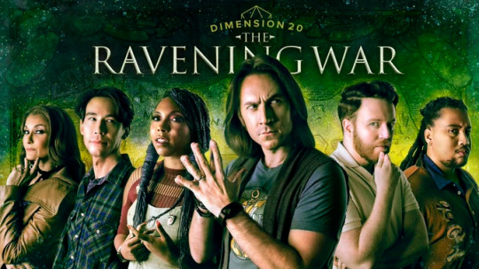
I'm gonna start with my favorite, which is this fantasy high poster. The title is really readable, large, and noticeable - which is great for advertising and for viewers to find the show. I appreciate how Brennan is leaning over the PCs, it's a cute pose and very much conveys that "I'm the DM" energy. I don't love how squished together all the PCs are, but the yellow light scribbles are a nice visual metaphor for a fictional world, and it's nice to see all the PCs in the promotion.

My second favorite is Tiny Heist. The descending height schtick is really cute, and we also get that fun DM-ergy from having only half of a giant Brennan. He also sort of feels like the one human in a muppet movie, which is a really cute vibe and compels me to watch. However his face is super washed out, the lighting from that photo was way too bright for him. I also really like the green slits, as they are a nice clean visual and the green color theme is pretty nice.
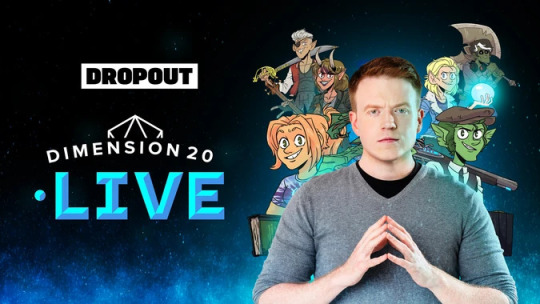
I don't hate D20 live either, but here is where I start getting a lot more nitpicky with the posters. Good things first - that title is really easy to read, and I like how the composition sort of mirrors the first Fantasy High poster. The prominence of Live highlights the unique live show element, which is a nice advertising move.
However, I really hate the entire right half of the poster. Brennan's got a real weird expression on his face - almost looks like he's playing Robert Moses or some sort of shitty businessman, which is not really applicable to this season that's a lot more about fantasy and mythical religion.
They've included all the cool new character art but completely covered it up by Brennan's giant body, and made that worse by surrounding him and Adaine's orb with light that makes it harder to see the art (I can barely see Gorgug's beautiful face...). This is especially frustrating when they have SO much free space on the left, and the totally squished right side.

Now we get to Escape from the Bloodkeep, which (and rightfully so) won the poll. I think from purely a design perspective it is absolutely the worst poster. The title is such a similar color to Brennan's shirt that it's very difficult to read, he's once again covering up a bunch of squished together character art, and there's the giant boring background of nothingness.
However, and I haven't watched Escape from the Bloodkeep so this is a lot of guessing on my part, it does feel like the right tone for the season. The red feels angry and villainous, Brennan feels like the right sort of Evil DM for this evil little world, and the expression is pretty fun. You may have noticed that this is only poster 4 of 5, and so this one is actually not my least favorite, but my second most, and this is why. The poster is pretty unappealing design, but it fits, and it prepares people for the season.

Finally, let's answer your question and say - I really do not like the Unsleeping City poster.
My design critiques follow some of the same design themes as before - Brennan is covering up key characters, the title is partially covered up by Brennan and less prominent than I feel it should be, and Brennan's once again been weirdly washed out. They also pretty obviously edited his shirt to be purple, which takes up so much space.
However, the thing I'm angriest about design-wise is that they have an absolutely GORGEOUS piece of art for the background and lettering for the title that is COVERED BY EVERYTHING ELSE! The colors used are incredible (the character art is great on its own but does not match), the stars and rendering are beautiful (which we can see some of but not what's below), and you can't see the upside down city! For a season called the Unsleeping City! Why can't we see the City!!!
I also personally feel like the vibe from all the characters and Brennan don't feel quite right for this season. All their poses feel very goofy comedy (a la Tiny Heist), but to me this season felt a lot darker and more human, especially compared to the earlier more comedic seasons. There was of course plenty of comedy this season, but I felt like some of those most notable things about it were all the mystical magic and tense human moments, which do not come across in this poster. I may be misremembering the season, but it just doesn't seem like it fits to me.
Tl;dr Unsleeping city is my least favorite even though Escape from the Bloodkeep is probably a worse design - because they covered up some cool art and it doesn't feel like it fits the season. An addendum: I have procrastinated this for so long for no good reason. I tried to start this a long long time ago and had no such luck. I really enjoyed writing all this and don't want to just delete it, so I'll leave my half finished bullshit under the cut. It's mostly just a lot of self-indulgent attempts at analysis. Read it if you want, this is mostly here for me.
Ok ok. First off apologies for how long this has taken to post I was inflicted by the horrors (first finals and then just some regular old mental blocks). But oh BOY do I have opinions on this !!!!! Buckle in everyone cause I'm gonna make this post MUCH longer than it needs to be!
So firstly this ask is referring to this post of mine, in which I critique some old dimension 20 promotional posters, and do a poll for which one is the worst. Escape from the Bloodkeep won, which is incredibly fair it's absolutely horrible and second worst in my opinion, however I do not think it's the worst. I've decided to drag this out as long as possible,
Chapter 1: What makes a promo image good?
I know I just decided to split this post up with Chapter titles but we're gonna also split up this section, since I think there's two separate parts of what makes a promo image good - delineated by the two words 'promo' and 'image'.
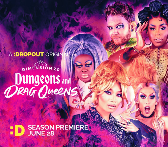
For the 'promo' part to be good the season needs to be accurately advertised. We need to be able to get the vibe of the season, to feel the kind of energy and appeal it's going to have, and we want to highlight some of the important parts of it. Take the Ravening War promo picture - it's dark and moody and dramatic. Then we've got Matt front and center, of course since he's the DM but also since his presence is a huge marketing point - he's even allowed to cover up the title! The newest DnDrag poster is also (I assume, since it's not out yet) pretty good at this. It's full of bright pink and strong colors and their poses really get across that fab drag aesthetic. They've also put the drag queens ahead of Brennan, since their presence is the big selling point of the season, and highlighted the fun play-on-words title.
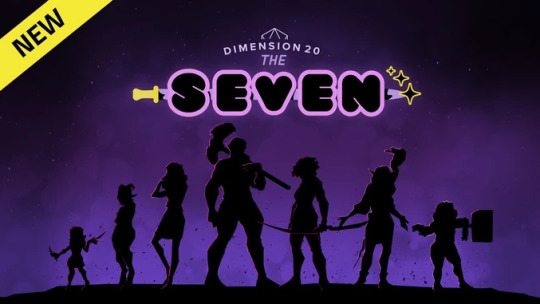
Next, for the 'image' part to be good, it should look visually appealing. There should be a nice layout and composition - things that are more relevant should be made prominent and put center or at one of the thirds, and elements should work well together. Also, if there is text, the colors should be chosen so that it is readable, especially important text. The Seven is my favorite example of this. They've got all the silhouettes nicely laid out to form that curve shape.There's some extra free space around the edges which are less important, while the center has the larger characters and the title so that it's more filled in. All the silhouettes have distinct shapes which makes it easy to tell who is who and pull apart the elements. The text is INCREDIBLY easy to read, with the bright pink outline on Seven creating the color contrast that it's important for readability (I'm a bit of a nerd about color contrast and the WCAG guidelines), and that combined with the huge font really highlights that word and its prominence. The weapon through Seven provides a nice thematic touch, and adds to that visual prominence.
Chapter 2: The Uncanny
8 notes
·
View notes
Text
Digital Character Design Workbook - Pt.2
today in class we learned about “Lines of action” how they inform and define dynamic character poses and also some light anatomy study.

we setup a large fresh canvas, and divided it into 12 squares. Using the grid assistant setup on procreate, I could do this very quickly and easily.

Group Character Research ~ Bojji
As a group we were assigned Bojji as our character to research, each team member was assigned a different method of research including, a word cloud, a mood board and a 20 question questioneer (which was my task)


After completing the group character brainstorming for Bojji, we were now tasked to individually create our own characters. We were asked to come up with three basic character backstories using the template seen below.
Once we had our three basic characters and their loose stories brainstormed, we moved onto refining them. I decided to move ahead with two of my character ideas. We added details and linked some of the theses pieces together and I did some full write ups to help show this.
Our next task was to further refine one of these characters by creating accompanying mood boards, questionnaires and word trees just like we did for the group character research. I decided to move forward with my Fantasy Postboy character.

Today in class we present three of our worked up thumbnail sketches, as A3 posters for critique. Each class group was tasked with providing constructive feedback (Seen as the purple sticky notes) and also compliments (Seen in green). My three images were very basic and really only a redraw of the thumbnails for the sake of exploding up to A3 format. The feedback is super helpful, and I think after reading some of it, I will attempt to combine the left and right concepts together. The other option I considered was to show more of the world, which is something a lot of people enjoyed about the middle concept.


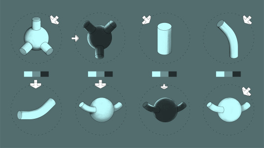
We looked at some fundamentals in lighting values, how the texture and type of light can drastically affect the final object and the mood.
We were tasked with completing some lighting exercises. Each of these shapes were originally blank, each has an arrow representing where the light source is coming from. Using the colour swatches below each shape, we were tasked with putting the values in the right areas depending on where the light source is hitting the object.
Now moving onto the final poster, I essentially broke the project down into three main parts.
The first being a basic line-art sketch and refinement. This is where I practiced some basic shape language as well as page hierarchy and composition, essentially this is a glorified block-out stage.
The second stage, I made further adjustments to the size of the figures but mainly i did a pass on the Posters title design, and border as well as plugged in my general values in greyscale.
The third stage was mainly working on colouring the poster. Once the colour was to my liking I did a colour grade pass over the poster, using a gradient layer and some saturation layers on very low opacity. This allowed my to further link all the elements together.
And as a bonus I have captured a Timelapse of the whole process.(Seen Below)
0 notes
Text
I was really looking forward to this module. The idea of picking any art competition for a university module was quite exciting. However, I had to tell myself to not get too carried away and choose a competition that is realistic for me to finish, which is why I went with the Animayo poster competition. A poster design is completely out of my comfort zone, and I haven't ever attempted to do one. So I would love to see what I would be able to do with enough practice and research. Furthermore, I've always struggled with composition and storytelling in my work, and it would really help me to learn and research more and attempt something as complex as composition for poster design. Not to mention every other new aspect of poster design I will be learning. Typography has always been an interesting subject, and something that I think is quite valuable for a student in the field of art and design, so this module was a perfect opportunity. Conceptualization was more challenging than I thought. What I knew I definitely wanted to do was not just do an illustration, but do an illustration that sends a message. After a lot of conceptualization and coming up with multiple stories, I chose a theme that was quite close to me, control and being trapped. This was inspired by my own teenage life of feeling restricted and having a lack of freedom, something i know that many other teenagers, especially in Sri Lanka feel, so I knew it was a topic that I needed to represent. After reaching the concept, I had research into design and art theory, like typography, composition and color theory. While some of these I was familiar with, some like typography was completely new to me, and as stressful as it is learning and implementing new things, it was also enjoyable. I was confident in my skills going forward, and for the most part, I didn’t disappoint. Execution was challenging. I didn’t think I would have to come up with as many variations as I did. It took a long process to come to the final composition that I felt was the most effective for my message as well as the most artistically pleasing. After reaching the composition, the artistic process was quite straightforward. The coloring and rendering process didn’t take nearly as long as coming up with the piece itself, which made me realize the importance and value of good conceptualization, and I learned to have patience and work on it instead of being in a hurry to draw and color. Overall, throughout this module, I believe I handled my time management quite well, and was able to be efficient with my work. Research is a place where I think I could have improved on, and looked more into the aspects of poster design and mainly typography. Even though I didn't learn a lot, I feel like I could have implemented it better.I’m happy with my illustration skills that I presented throughout this module, however at the same time, I do not feel like I reached my full potential, I am however satisfied with what I was able to create, and I’m proud of conceptualization and creativity.
0 notes
Text

wk03 / sdl / poster concepts
this week i experimented with a few different poster designs using the techniques that we learnt during class. i wanted to explore positive and negative space a little more and go for a minimalist look with my designs. I think I achieved that really well in the third poster (my personal fav of the 3). As an illustrator, I am used to focusing in on detail, so it was a bit of a challenge for me to come up with a simple yet effective output.
my first poster is probably my least favourite (to be fair, it was the first of three that I made too so it was kind of the experiment piece of the lot). i like how i played with opacity and line, but i did feel that the composition was a little bland and didnt have much character or creativity to it. the white text on the black background does make everything stand out nicely though...
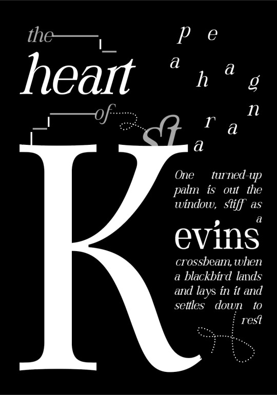
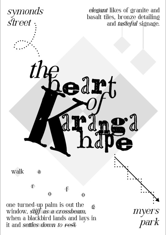
2. i wanted to stay consistent with typography and only use 1 typeface, however I ended up branching out a little in the second poster and instead used 2. reason being, I wanted to convey a bit of the grunge feel of st kevins into my design. I am still deciding whether or not I like the combination - I might have to get a second opinion. i did think i was clever playing with opacity and tint to depict some of the physical forms found in the arcade; the tiled floor, the hanging lights and the staircase. I ended up using the staircase idea in my third poster as well as I felt happy with how I executed it.
3. my third poster, as I said, is my favourite of the three. for my own record, and for assessment sake later, ill breakdown my design choices a little. the main focus of the piece are the two lowercase K's - one which i rotated around, and then I aligned both the stems to sort of have them blend into each other. the two K's represent the K in kevins and in karangahape (where the arcade is located). the exert - which is taken from a poem I found called St Kevin and the Blackbird by Seamus Heaney (that was also recited at St Kevins Arcade back in 1996). i used this in all three of my designs as I thought it communicated the feel of the place, and it was also a little more creative than just slapping a straight description of the place down. i also decided to highlight some of the key words that i felt fitted nicely, and cross out the word 'rest' as i wanted to communicate my site as a hidden treasure to wander and take in the sights. the dotted line represents the staircase that lead down to myer's, and the letters placed in little diamonds (a repeated shape within st kevins) spell out 'go for a little walk' (spaced out purposely to portray the action). if i feel happy with this and choose it as a final, i want to try and screenprint it - i think that the texture would be really cool and its an easy process as its black only.
i need to be a bit more speedy with the work im producing and spend less time worrying about perfectionism. bad habit whoops 😿
1 note
·
View note
Text
FINAL REFLECTION
Here is my final poster!
I am extremely happy with this and pleasantly surprised by the personal growth in skills I have made with this project.
Creating my digital artwork for this elective has been a transformative experience, challenging me to explore new techniques while expressing my creativity in a digital format. Throughout this project, I have learned valuable lessons that have enriched both my technical skills and artistic sensibilities.
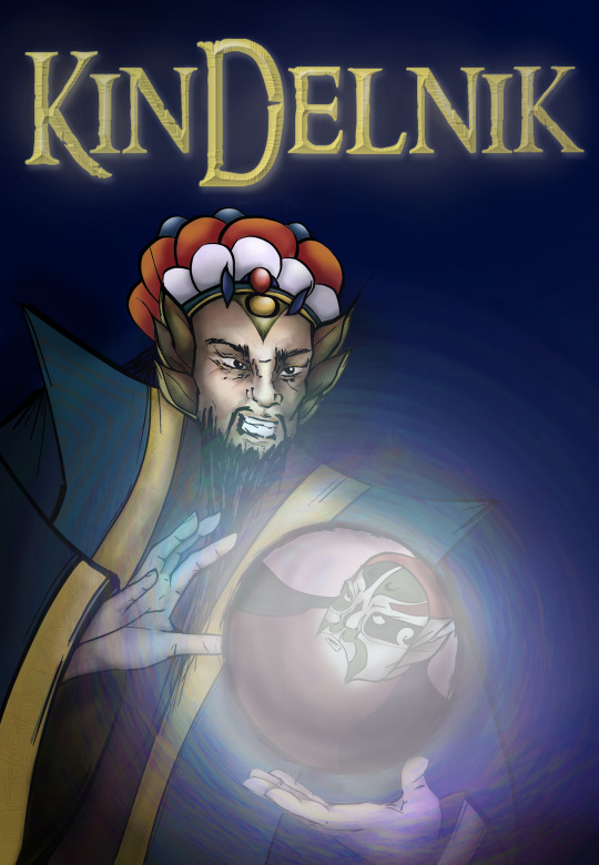
Concept and Inspiration: The concept of my artwork stemmed from a curiosity for Chinese outfits/ Peking opera and a desire to explore these elements through my designs. I aimed to convey a conflict of power in my composition as well as show my narrative in the fantasy novel book poster format. This concept was important to me because it took me a lot of research and design work to create an accurate representation of the different styles of Peking Opera presentation, while still having my characters be uniquely designed.
Technical Execution: In terms of technique, I experimented with different brushes, hue saturations, colours and drawing styles to create my final poster. Learning to navigate these tools was initially daunting, but through perseverance and practice, I gained confidence in digital painting, composition, color theory but most importantly, keeping things simple. Being someone that likes to focus on a lot of details, it was a hard process for me to simplify my work, however, I feel as if I have improved on that during this elective.
Challenges Faced: One of the major challenges I encountered was time management while I was sick. I feel like there are a few key exercises missing from my workbook because of this, and also the exercises that I did complete later on were rushed as I tried to finish them all on time. In the future, I would like to plan my time out more efficiently, as well as the energy I would like to devote to certain tasks. I really need to learn to prioritise certain tasks over others in order to complete everything on time.
Another challenge was giving myself too many colours to work with, resulting in an indecisive situation. In the future I will limit my colour palettes, and give myself more time to work on the actual design than think about what colours should be use.
Another challenge for me was, as aforementioned, simplification. I tend to go too big with my ideas, and not have the time nor the ability/skill to complete them, leaving me feeling quite disappointed with my work. For instance, my initial character design was far too complex, but I tried my best to still capture the essence of my design in a much more simplified way, and place more emphasis on the mood created, rather than how detailed and complex the actual art was.
Evolution of Ideas: As I progressed with my artwork, my initial ideas evolved in unexpected ways. I found myself changing my concept with help from my teacher and peers and with the feedback given. This really helped me focus on the main point of the project: the mood that is communicated, rather than the details of their outfits. This evolution taught me the importance of flexibility and adaptation in the creative process.
Feedback and Iteration: Feedback from peers and instructors played a crucial role in refining my artwork. Their perspectives helped me [mention specific improvements you made based on feedback]. Incorporating this feedback enhanced the overall quality of my piece.
Personal Growth: This elective has not only honed my technical skills but also deepened my appreciation for digital art as a medium for self-expression. I have gained a greater understanding of colour theory and simplifying things more.
Conclusion: In conclusion, creating this digital artwork has been a fulfilling journey of exploration and learning. It has equipped me with valuable skills and insights that I will carry forward in my artistic endeavors. I am proud of how my artwork has turned out, and I look forward to continuing my artistic journey with newfound enthusiasm and confidence.
Taking the digital art course was a big step for me. It taught me how to use new tools and techniques to create art on a computer. At first, it was hard to be able to manage time, generate viable ideas and use PS brushes, but it felt really good once I got the hang of it.
During the course, I learned that digital art is so versatile. It let me try out different styles and ideas, which helped me grow as an artist. Getting feedback from my teachers and classmates was super helpful too. It showed me how to improve and see my art in new ways.
Overall, this course gave me skills I can use in the future. It inspired me to keep exploring and being creative in my artwork.
Thanks Toby for the great elective :)
0 notes
Text
Poster Feedback From Peers And Finishing The Project
Presentation
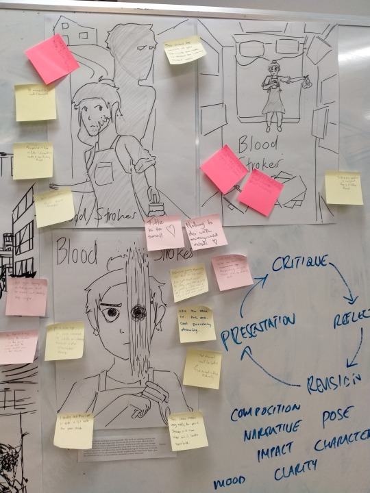
We needed to choose three poster sketches to turn into greyscale A3 posters to be presented along with our 100-word description of the character's backstory.
People in groups of three would offer positive criticism on a yellow Post-It Note and negative criticism on a pink one. The criticism could be about anything (composition, proportions, perspective, etc.)
My group was Katherine, Lindsay, and I. We did not provide criticism for posters made by people in our group.
Critique
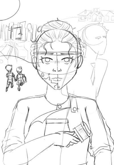
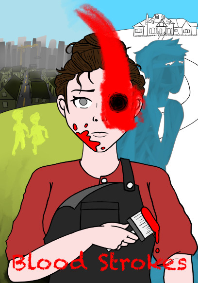
People seemed to like all the compositions for different reasons but the one with the paint stroke covering Claudia's eye seemed like the most popular. People said the paint stroke imagery was a good idea and it was striking/interesting. One group also said it didn't show much narrative.
The top-down poster was praised for its perspective but once again, a lack of narrative. One team said the character could be bigger in the poster.
People liked how the final poster included Edwin and overall told the story/showed the conflict the best and most clearly. Someone said the house in the background looked quite high and asked if it was intentional.
Many of the criticisms were regarding the text, likely because I rushed that part in the A3 posters. Text placement, size, font, and clarity were among the notes.
In terms of general notes, there wasn't much. One group noted that the posters don't depict the wealth gap or reference money at all. One of the teams also was confused as to why the neighbourhood being bought by Edwin was a bad thing.
Reflection
Moving forward, I want to use the poster with paint covering the eye since that was the most popular one and it's the most unique as well. To include more narrative I might include Edwin in one of the negative spaces in a similar manner to the poster he already appeared in. I might also show them as children to show how they used to be friends but naturally grew apart and it would help the conflict in the story and the two sides of Claudia's face in the poster. I initially wanted to keep this design simple but adding more along the sides could really add interest and guide the eye through different parts of the poster.
For the text, I want to pick font(s) that fit, such as using a paintbrush-like font for "Strokes". I might not choose a bloody/drippy font for "Blood" since that probably won't look very good and won't help with clarity. I also want to move the text to the bottom to leave more room for additional visuals.
In general, I want to depict the importance of money/the wealth gap without literally including cash or a cheque. I could use the contrast between Edwin's high-up, pristine, secluded mansion, and Claudia's poor, run-down neighbourhood. I also want Claudia to look rough around the edges with messy hair and worn-down clothes. Early versions of the Edwin silhouette included a tie and collar which could be re-added if desired.
I need to rewrite my 100 words to emphasise the threat of gentrification which not all people know about or understand fully.
This week I want to focus on composition and colour. Because I plan to change the composition a lot by adding more elements, I want to focus on doing so in a way that is pleasing to the eye whilst including everything I want. I also want the colour to be a focus point since Claudia will primarily include red, so I want the left and right sides to have colour schemes that complement it and don't take away from Claudia in the middle.
Revision
I slightly changed the 100-word description to emphasise that the neighbourhood redevelopment is bad for those living there.
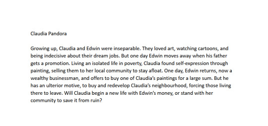
I started by creating a new sketch digitally, tracing over a scan of the original drawing (not the A3 version). I used the symmetry tool for most of it.
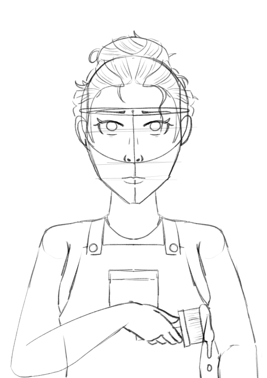
I changed the head proportions and added her sweater's details. I also roughly sketched out the background characters and details.
I added the values for Claudia and the prominent non-diegetic red parts of the image including the vital blood stroke. I used a Photoshop mixer brush for a more realistic paint stroke since it simulates how paint spreads, mixes, and the thickness of the paint. I also used this for the title and texturing silhouettes later on.
I settled on a triadic colour scheme with green on the left, red in the middle, and blue on the right. I filled in Claudia's colours based on the values and created a green palette for the houses and grass on the right. I decided I also wanted the children on the left to be silhouetted and used a lime colour to fill it using the mixer brush and for Edwin's silhouette. I added an atmospheric effect to the buildings in the distance by using a grey soft round brush at a very large size and low opacity. The sky is also lighter and duller on the left side. I used the smudge tool at a large size to smoothly transition it where the blood stroke reached the top.
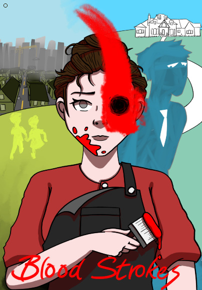
Before I completed the mansion's colour, I took time to add the shading to Claudia. I used a dark red rather than a black to make it look less boring and have it fit better. I also added the title and removed the shadow on the houses on the left since I thought the background had a bit too much contrast. When I added the grass on the right side, it was a bit more on the blue side to fit the colour scheme and provide more contrast with the opposing side.

Finally, I coloured in the mansion using a blue palette and added a slight atmospheric effect to match the left side. I gave the title a backdrop using the mixer brush again to add more readability and contrast to that part of the image. I added highlights using the screen layer mode once again. Finally, I selected each half of the background and adjusted the colours so they matched a bit better and to help the background stay in the background since there was still some contrast I wanted to remove.
0 notes
Text
Character Design Final (Part 2)
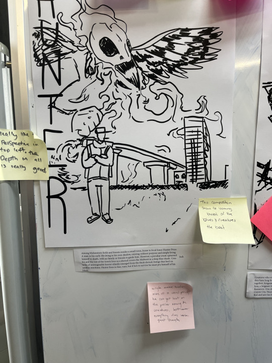
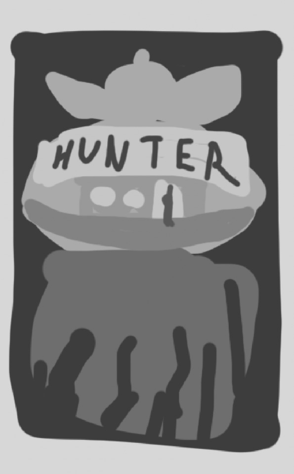
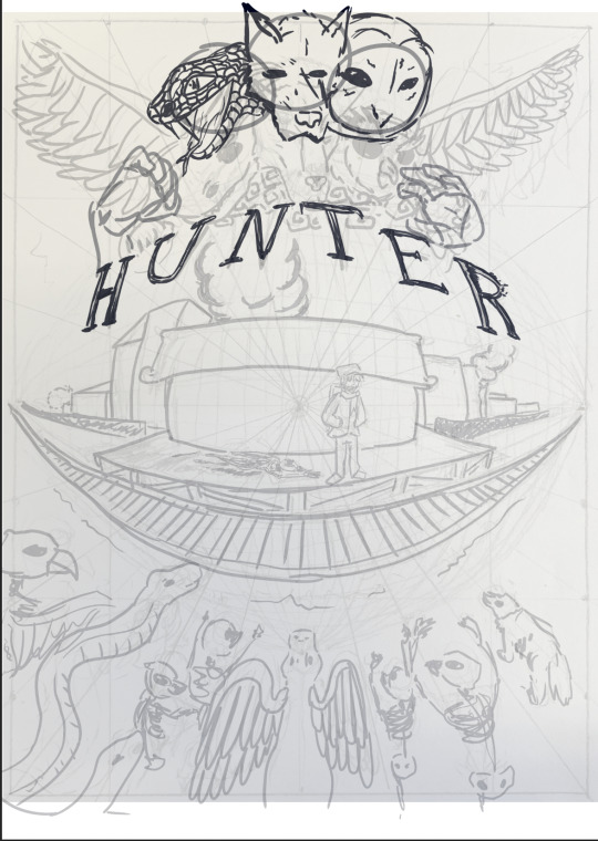
For this composition people liked this composition for it's "Looming" threat, feeding into the 100 words the most. But, also at the same time the title looks like it's clashing with the creature. My Response: I definitely agree that this tells the story the best, but, I also think people missed another critique here. I think that the composition is quite left heavy with the title, the main character, and the main monster appearing on that side specifically. People also critiqued the title, saying it clashed with the monster, and I both agree and disagree. I agree that it definitely covers up parts of the monster, but I also disagree because it wouldn't clash in the final design where the title looks quite different and quite bold.
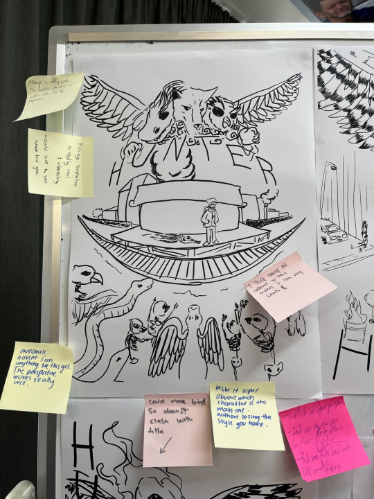
2. For this composition people really liked the fisheye perspective which could be an element that I play into more. Someone said that the creature being at the top made it look small.
My response: I agree that the creature at the top looks too small, I might make it look more like it's looming over the train stop. Something like this:
Except from a different perspective.
3. For this composition, people complimented the perspective of the image, I might find a way to play into this. Also, someone appreciated the relative calmness of the scene compared to the other compositions.
My Response: I appreciate the feedback, but I would've liked to see more critiques for this one in particular. Here's some of my critiques: The person and car in the background are too small, the sidewalk makes no sense, there's not much going on in terms of building ambient visuals, and the body proportions of the monster is off a bit. The main character could also use a decent dynamic pose, and the monster could be doing something other than just standing there.
A general comment someone made was that hunter doesn't feel like a main character as his presence isn't the main focus of pretty much all of the posters, and I agree kind of, and I feel like that's an issue that'll fix itself when I introduce colour.
FINAL WORKINGS:
Which did I choose?
Why? I guess I just really like the fish eye perspective, it looks quite good in my opinion. It's definitely memorable, and quite an unusual choice for a movie poster, but I think it works really well. Usually fisheye perspectives are relegated to fashion photoshoots and album covers (which were my main inspiration), but I think it's definitely underrated. It looks super dynamic, brings focus to the centre of the composition, and has arcs warping around it allowing for interesting shapes to pull through. I was initially hesitant to even try a fisheye perspective because of how difficult it looked to pull of on paper, but it definitely worked out.
Figuring out Colour/Values: The next few images are me testing the values and colours for my final image early on so I am able to keep in mind a general tone of the image.
Here's my base value scheme. The character is going to be silhouetted by the light from the main building in the composition with main lightness coming into the middle area.
Here's a split complimentary palette with greenish yellow, pinkish red, and cyan blue. It mixes both blue elements and red elements which was the plan from the beginning. It's got an aquatic vibe to it which could work, I might consider this palette.
This is another split complimentary palette. I'm not sure what to think about it, because it's risky to go without blue as it is a major theme. I do like this, I like the green especially and how it makes the character stick out a whole lot more, but I'm not sure.
Another split complimentary palette, this time swapping the blues for reds and reds for blues, and I have mixed feelings. I think the red works well in the background, making the whole image look quite apocalyptic, but I'm not sure about the blue/green. It looks sort of out of place. It might work really well, definitely one to experiment with when the time comes.
This is more what I'm going for, and will probably end up as my final palette. It works well with the idea I already had planned out, and I've already explained the importance of the blue/red contrast.
MAIN PROJECT:
OK, here we go. Firstly, responding to feedback. I've made the title more defined, but it still might not stand out against the background, so I'll have to figure out how to make it more apparent. I've also made the monster at the top a lot bigger, and it definitely looks better. I've also adjusted what type of heads I'm using. Since my theme is quite Americana based, a dragon head doesn't really work, so I went for a snake head instead cause snakes are actually integral to culture in the U.S acting usually as villains (take the bible and how christianised the states are). I've also aimed for forming the dog head to look more coyote-ish, not sure if the difference is there, and I've made the owl head a barn owl, an owl I love and it's found in North America so it fits. I've added some looming hands, though I'm not sure about their shape.
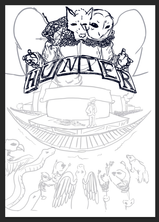
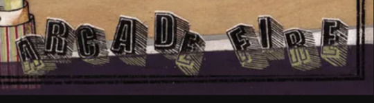
I've fixed the hands, added some wing structural stuff, and added a body. I definitely like the hands here a lot more, almost giving emphasis to the title as if the monster is presenting the title itself. I've added the smoke collar thing, and I'm not sure if it works, I might have to adjust the snake head to be a little less detailed, it might be good to line up the snake head to improve the monster's silhouette. I've added these tiles under the title to further seperate the title from the background and I love it. It looks awesome, and I specifically too inspiration from this font here:
because I love how it looks. The title will probably need some adjusting to make it look less messy though.
I've made the title blocks more consistent in which ones look like they're overlapping, the might need further adjustment. I've also taken this opportunity, to add a sneaky little subtitle as graffiti to the top of the main building. I've adjusted the pose to the character to have the crowbar in hand, and looking afraid, so it makes sense. The wings curved in also close off the composition as well, keeping focus within the centre of the composition with directional lines at the tips of the wings pointing towards the title. The line thickness will be adjusted in the final outline. I've also added these patterns on the lining of the cloak, a eye and tear to represent why these creatures are here to begin with, to associate them with negative emotion.
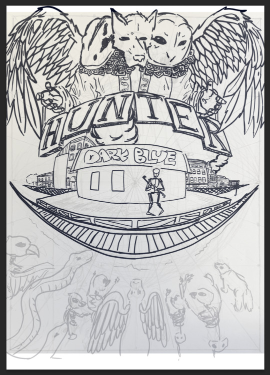
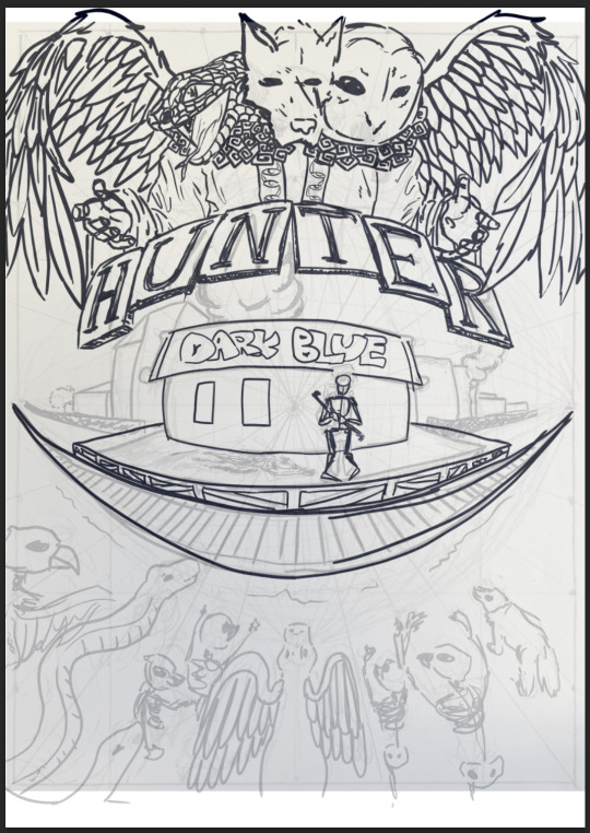
I've updated the snake head to work better with the silhouette and I've removed the detail from it as well looking less clunky and more balanced. I've added some details to the buildings, taking inspiration from some smaller apartment buildings that you might find in a smaller town. Less sleek and slick windows with sharp metallic silhouettes and more homely brick and arches.
I've updated some details, adding some smoke to the right, but I might need to add something in between the TER tiles and the buildings below cause it feels a little empty. I've also used the transform tool to stretch out the graffiti to fit better in the fisheye perspective.
I did this by holding command while adjusting the transform corners.
I've tried adding some detail to these planks, but it's out working out too well. It looks like a complete mess, i might leave this part out.
I'm just going over the monsters at the bottom to give them detail.
I've created some skeleton monsters somewhat related to Americana themes. I just need to add something to that middle part.
Here's the final outline, I've added some more smoke to balance out the composition wich I might change later. Now I need to outline it in A2 and fix some of the lines.
0 notes
Text
#fucki t#i saw it around the evening but i thought that if i start tagging i would lose the time i needed to make the final assignments#its almost 2:30 am lets see
sorry for ruining your sleep <3/j hope it was worth it <33
#first of all DUDE SERIOUSLY?? ? ? ? YOU JUST WENT AND DREW TWO PICTURES BC YOU STRUGGLED WITH ONE ?? ? ? IDK HOW IT WORKS BUT YAAAAYYY !!!#CRYING WHAT THE FUCK#No i think the first one is my fav so lets start with the second#okay i looked closer at the second one and now im not so sure which i like more augh well nvm ! looking at these colors. theres probably so#some blending mode business is going on (which is socool theyre so difficult to me personally i can never make those work) all in all it#looks like postcard paper? or some yelowwed paper buut if blue color faded instead of red
Its called gradient maps and they are my best friends <3 I love using them when I cant come up with a pallete,,,, also used posterization a lot, it makes such funky textures!! and the colors that come out are soooo cool,,,
#my main focus is the wd (kelp cant keep track of names) and it has this one blue repeating throughout the whole thing + some purples + peac#+ thiss orangish grey?? it looks really orange in this context i dont even know what it is and Green. you could literally colorpick rainbow#from it . bro managed to sit his ass on it lets pray for his pants <3 DAMn colorwizardry again on his arms goddamn it ! ! AW HES SMILING#like his dreads here . tbh whenever i make a kelp sketch page (oka that happened at least two times) i try drawing him from the back just#just cuz im still not sure. but this looks legit mb ill use it as a ref lol ! using noxs drawing for the front and yours for the back lol#whose oc is that ToT also his hand is so cute here i cant <3 dying from this purpl#also thank you for giving him oversize goddamn hed actually like it a lot. like now thinking about it. in modern au hed need a hoodie#a hoodie 1.5 times bigger than him. and a tshirt with sleeves falling lower than his elbows... . i recently tried to figure out his adult#version design and im shifting my focus now. . . my idea was like sd-scaled almost-knight but no he needs to be a dementor with 14 layers#the wd is smiling <3 i like how you always make them so Long and so roller-coaster shaped theyre literally a крендель also the air perspect#perspective is peak it almost fades into sky color ! now thinking about it wds are perfect dragons for stuff like that cuz theyre so long
I actually wanted to make him come out of a cave or something but it just didnt work :( so flying under stones it was,, I glad I got the back view ok :33
#textre brus . . . OR WAIT NO ITS NOT THIS HATCHING IS MADE BY HAND 0_0 WOAHG.. . . idk something about this mountain thingie is#just so cool. this hatching is just right also i like how wds body ended up significantly lighter than it due to the air perspective. this#this may be the least intuitive composition desidion for me actually wait. so instead of making the mountain rly light you lightened the wd#you go girl this is fire . its like chessboard. does it make sense#anyway a little moment of appreciation for the green on the little mountain closer to camera bc 1. it is awesome 2. looking at your brain#under microscope. IT EVEN CONTINUES UNDERWATER GIRL HOW oh this is made w a texture brush i found it >:)#tho mb its all a texture brush just its so small i dont see </3#im running out of tags so just know im just sitting here zooming in and out
>:3333
#part two what do you mean ive been sitting here for an hour i need to wake at 7 . okey speeding up guys#аа кто такие фиксики большой большой секрет or idk what theyre trying to say w this hand gesture but they both look like theyre having fun
They'r saying hi <333
#no actually three of them look like theyre having fun and zhora looks like he knows hes the most strong and majestic creature on earth#like he took a biiiig breath and is about to make a super powerful wing flap#the way this wing is folded is honestly amazing zhora has never been this powerful and i reallllllly like the lil hatching under his wing#i generally like your hatching a loooot DAMN ON THE BELLY TOO LOOK GUYS#the crown (tubes?? ? idk what to call those i think those are a sort of receptors for chemicals and electricity) being purple here#is amazing. still love the 'thunderdrums are colored like tropical toads' hc ANd still havent researched the toads to choose smth for him#hes a chameleon you dont get it/j also wd is darkgreen + light green for the crown and zhora is orange with rather dark purple for the crow
I think they're supposed to be external gills in canon but i love your take on them as the tubes. they look so neat that way!!
#i just find it sweet. in actual plotline they dont interact a lot i believe i have like 1 little story for them and thats it#but i think aqu would find him cute :) i like their face here theyre joyful for once BUT IM already impatient to go for the first pic bc#bc its just amazing im dying from this compo !!!!!!!!!!!!!!! !!!!!!!!!!!!! and colors !!!!!!!! like its not as experimental as 2 but its ve#very readable. come on you know it is ! everything here serves composition dark lord and cunt#aqu is fucking amazing. and adorable. sorry i liked the backview more but iddkdidk it makes me feel feelings#almost. almsot makes me think about whatever their story is. they unlike kelp dont really have one bc theyre ME but maybe. maybe
👀🤲🤲🤲🤲 story? story of aqu???
#their purple is amazing and the way the vest is shaded w lasso is amazing and the pose is amazing and the sleeves are amazing#waving their stupid little hand <3 kelp what are you saying their ass is Not Listening OH WAIT I GOT IT THEYRE COMMUNICATING THROUGH#HAND GESTURES. I GOT IT I GOT IT !!! kelp yu lk need headphones too bc the second zhora opens his mouth youre having a panic attack#a man who gets flashbacks from loud dragon noises is forced to hang out with thunderdrums and screaming death(deathS >:)))) )#bc the life is unfair. aw his nosee !!!!!!!! hes so cute i cant im dying ! helmet tho. .. . . . OH MY FUCKING GOD WDS FACE.. 0_0#ITS GIVING... . I GENUINELY MEAN IT AS A COMPLIMENT PLS IT MAY SOUND WEIRD BUT ITS GIVING MOBILE GAMES LOADING SCREEN VIBES#LIKE ONE OF THOSE GAMES WHERE THE PLOT AND LORE IS EPIC AH BUT THE GAMEPLAY IS BORING SHIT THEY WOULD KILL FOR THIS FACE#THIS FACE ON THEIR LOADING SCREEN OR EVEN THEIR ICON TBH!!! idk i think its the reflection in the eye that got me#so wow. and the nosehorn is cool too this faceshape is generally peak#a little mwah to their wings theyre very volumous. AND ZHORA'S WINGS OMG THE SPOTS!!! ZHORA'S LEFT WING NHHH#thats so cool. same brush as the sky. the most random brush in the world why does it work so well#its here in the waves too ahhhhhhhhhhhhhhhhhhhhhhhhhhhhh#the waves........................................#the wavessssssssssssssssss.............................................#exciting piece
my reaction to all of that ^
btw the night pic was done on 90% lasso tool <3 i only used a scetter brush for stars <333 went a little insane honestly once i got the understanding for lasso tool...
@tanasha-not-yet

hey. its yo boisssssss!!!
56 notes
·
View notes
Text
Idea Restructuring

The key theme I wanted to explore with this video is AI and its impact on the future and somewhere in my short about AI I needed to include a few different compositing techniques which made sense in the context of the video.

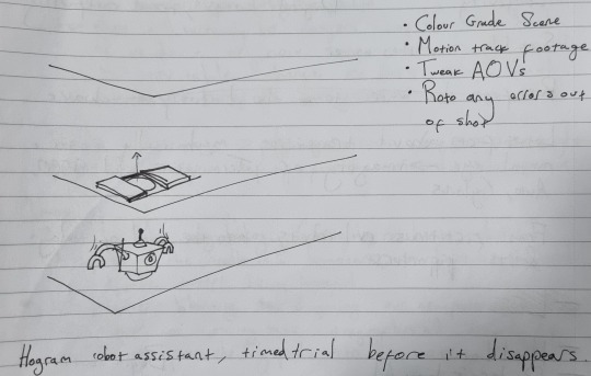
I knew that I needed to incorporate some motion tracking into the video so I thought that a robot assistant would be a good fit and I could explore how things might play out in the near future when these sort of products are released to the public. How would they be executed:
Would they be just as imperfect as digital assistants of the past like Clippy and Alexa?
Would they follow subscription models?
Would they need upgrading or replacing every time the company wanted users to buy more of their products?
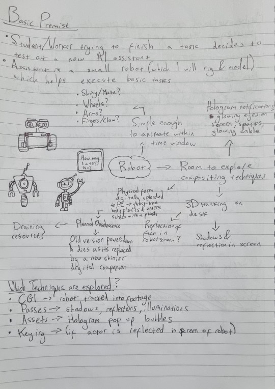
I started planning what the robot could do based on the basic premise of the video and how I could incorporate interesting compositing effects. The types of compositing techniques I could explore with this premise are:
CGI - Robot helper made in Maya tracked in Nuke (possibly also used for hologram pop-ups and delivery tube aswell)
Passes - AOV layering onto footage
Assets - Sparks, glows, smoke (if robot gets smashes), text layering, wall detailing (posters/logos)
Colour Grading - sell the tone of the short
Keying - Reflections in shiny surfaces of the robot keyed in post
Rotoscoping - removing unwanted objects from the shot to polish the final cut
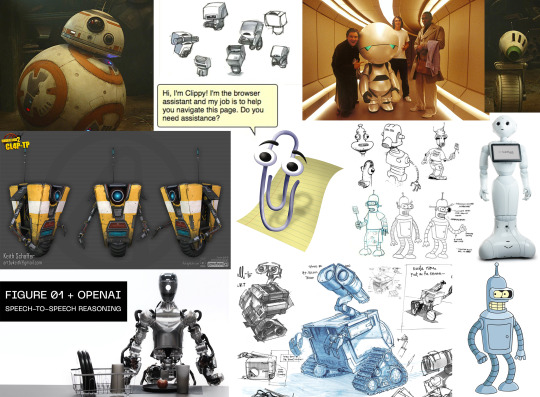
Here's a quick mood board for the robot, the two I had most in mind were Clippy and Claptrap both of which are assistants which tend to get in the way and irritate people (a wheel also works better as a time saver as I don't have to waste time animating legs unnecessarily).

Here's an overview of what I have time for in 30 seconds, in the past I have gotten carried away with ideas which aren't suited to a 30 seconds short so I need to keep things simple. I didn't want to spend too much time on the character design aspect as the module is about how I utilise assets not how I create them so I am following a rigging tutorial to make a simple robot that I can play around with for this short.

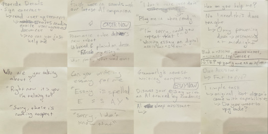
At this stage I was just trying to figure out what to write in the script and what mistakes the robot would make/ what its purpose was/ what its dialogue was. I used an amazon alexa to get some ideas of how modern day tech misinterprets prompts to pick up on some different quirks that I could adapt for my robot.


Here's the start of a storyboard based on my ideas so far, I can't quite figure out the script after the introduction with the interaction between the worker and the AI assistant so I stopped here to rethink some other things. I tried mind mapping a few ideas but it all just felt forced and I couldn't figure out something which actually made sense within the context, a lot of the ideas I came up with felt arbitrary so I took a break and focused on other projects temporarily.


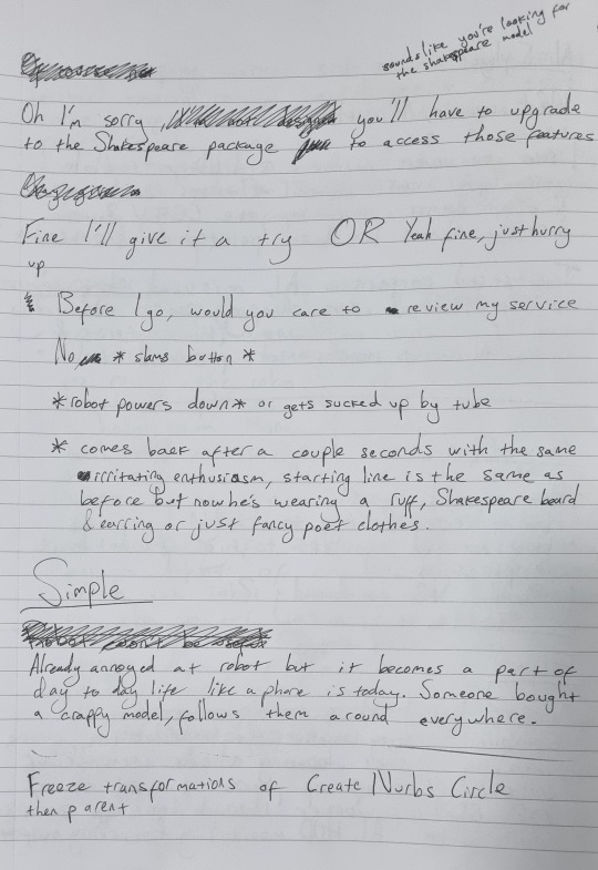
I revisited things and tried to develop my concept further and figure out what it may look like and what the dialogue might sound like. I just couldn't get anything down which felt right so I just wrote down as much as I could think but things still didn't seem right so I left things to stew a little longer instead of trying to brute force something which clearly wasn't working as intended.
0 notes
Text

Chapter seven of the textbook talks about the Evolution of Typographic Technology by starting at hand compositing of movable type with a letterpress. This is actually really interesting because this coincides with a visiting artist we had who is displaying his work made with letterpress typography in the gallery. Using these old forms and knowing the history of typographic like referencing handwritten and moveable letterpress type and how that has been adapted to the digital sphere I think is really important and for me grounds what I am doing in a more real sense and has helped me understand typography better knowing the physical ways that things like leading are when they were physical blocks of metal that spaced out the type. The text then talks about other machines and developments in typesetting technology including the linotype, the monotype, and photo typesetting. I had never heard of photo typesetting, which is where film negatives of characters are exposed onto photographic paper very similar to the way film photographs are developed. I think this is a really interesting process and though not as effective today could be really interesting to play around with and use for aesthetic reasons in the future. The text then talks about how typesetting was transferred digitally and adapted to be used on different platforms like mobile phones, websites, and print products.
This week in class we dove into laying out and finalizing our poster designs and getting feedback before we start to use AR to manipulate them. I tweaked my designs quite a bit over the week as I had spent a lot of time figuring out how I wanted to do the type. I had the idea of taking spray foam from a hardware store and making my type from this. I however had a lot of trouble making the letters have this round and friendly shape them I wanted so I ended up having to create a texture from the letters that I had scanned in and use that as the surface in making them 3D. I was really disappointed my idea didn't work out the way I had originally planned as I wanted to be able to draw the letters with the foam but did not think about how the foam would expand and I couldn't control how much it would and the letters would become hard to read. Overall I wanted this nice texture and I worked around some of the problems to get it but if I had more time I would want to try and create the typeface physically entirely not half physical and half digital so that it had a loose human feel to it, but time, and the amount of spray foam I could find just didn't work. I taught myself how to create inflated 3D shapes which I had a lot of fun doing. I was nervous at first but now I feel comfortable making 3D types in Illustrator. My next challenge will be moving forward and adding the AR to the poster. I think I want to make the letters bounce as if they were balloons or deflate in some way but I don't know how to go about doing either of those so I'll have to see.
0 notes
Text

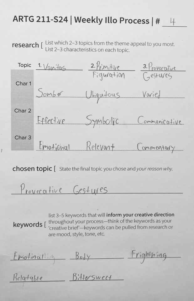
Illo-4 Human Body
Topics of Interest
Vanitas. Sombre, Ubiquitous, Varied
Primitive Figuration. Effective, Symbolic, Communicative
Provocative Gestures. Emotional, Relevant, Commentary
Final Selection, Provocative GesturesBecause when I was choosing a topic I was drawing a blank. So I picked the most emotionally charged category and started researching.
Provocative Gestures
Provocative gesture refers to depictions of people designed to evoke an emotional response from the viewer. The emotion can be anything. What slots a design into this category is that it's a person, and what they're doing carries emotional weight and relevance.
Works in this category often pull on preconceived imagery and tropes, but place them in a new light that gives the viewer a new idea.
Creative Concept
I wonna make a poster to help fight depression, negative intrusive thoughts, self-loathing, all those mental health issues. At the same time, I want to make something that gives credence to how scary that can all be. It's a relevant concept to any demographic and can never use enough support.
I’ll depict the struggle of it all but imply progress or finding a way out. In my sketches, I kept returning to a simple, hunched, panicking figure, he’s almost a little icon. I stretched his shins so it looked like he was standing on stilts, or taking off. My plan is to depict him in the sky hiding from a murky and chaotic scene below.
The provocative gesture will come in with the figure's obvious vulnerability contrasted with its powerful place in the hierarchy of the image.
Keywords
Emotional
Body
Frightening
Relatable
Bittersweet
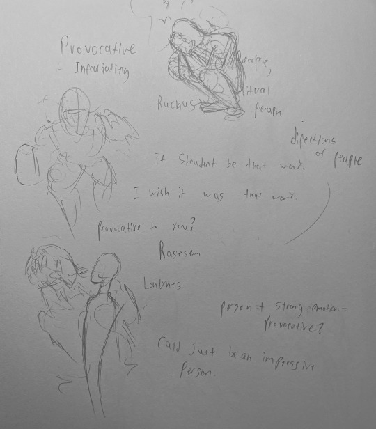

Design Decisions
I made the figure a lot smaller, and more muscly than I originally intended. When I first thought him up he was an emaciated waif, but making him look sickly rendered him too sinister. Drawing him tiny also helped him seem like an underdog fighting against the odds rather than looming over the viewer. The scene… works. I opted for a forest of decrepit telephone poles and added a circling vulture. I added depth with dozens of chaotic, unclosed, overlapping, and terribly anchored paths that make for interesting patchy shadows. I was trying to depict a setting that exuded uncertainty and anxiety. But to be honest, I think it probably would have worked better with a much simpler background. Drawn more attention to the subject matter.
The caption “Fly If You Let Me” is minuscule at the bottom of the composition. I wanted a phrase that wasn't optimistic but wasn't only doom and glume. A little microcosm of the wider image. It's small to give a sense of both powerlessness and intimacy. Im hoping it talks more directly to the viewer after they've seen the other elements.
Programs
Adobe Illustrator
0 notes
Text
5 facts on: Roy Lichtenstein 1963 Whaam! Oil on canvas; 5’7” x 13’4”
The work composition was based off a panel drawn by Irv Novick
Lichtenstein used different colors on his first drawing than on the final product
Lichtenstein projected the previous drawing onto the canvas, sketched the projection in pencil, then started his painting
Lichtenstein first added Ben-day dots using an aluminum mesh and pushing his oil paints through the holes with a small scrubbing brush
Lichtenstein then painted over the dots with acrylic resin paint
When I first saw the art, I immediately got excited as I absolutely adore comic art. The more I learned about this work the more I liked it. The artist took inspiration from someone and made that his own. The colors used are striking and draws to something different each time. This art brought out all the feelings I love about looking at comic art.
2. The art that hangs right to the side of my door that I look at a lot would have to be my poster I got of Gone With the Wind. It seems to be a digital design. The poster has striking colors and draws in attention. There is a nice contrast between the fire in the background and the charaters in front.

3. I am somewhat knowlageable about art but have not done it after a bad experience in art class. I have multiple friends who are amazing at art and all in seprate styles. I have gotten much better over the years. I am 18 years old and do not mind the gender that people refer to me as (any). I am from Palmetto but quite like the cold and have family in both Michigan and Maine. I am mixed and enjoy singing with my mom and hanging out with friends. I am not a member of an organized group. I work at Starbucks.
4. Comic strips, my rabbit, me, my friends. All things I love.
1 note
·
View note
Text
Unit 2 Reflective Journal - Lim Lin Year 1 Production Arts for Screen
For the next unit, we are introduced to designing and making. For the next five weeks, I will be recording my progress and reflections for both the 2D and 3D components of this project.
During the first lesson of the 2d component of this unit, we were taught how to convey storytelling in a scene, in which the setting allows the audience to know the story. Several factors such as the angle, atmosphere and shape language create a scene in which the character, personality and time can be shown. An important part to take note of is to ensure that the viewer knows what the drawing is about, and to do so we should plan the artwork with a story in mind and use different design elements to create context and meet the audience's expectations through the medium. For the practice we had this lesson, we had to redraw a child’s bedroom into one of a spiteful 90-year-old.

I decided to change the bed frame to a hard metal frame, replaced the small tv with a larger one, removed the posters while leaving marks of it that were stuck to the wall, and added a few old storage boxes to imply that the elderly person has grown out of their past hobbies. I also tried to show the age of the elderly person with several other changes such as changing the furniture to more antique ones and adding props like the floor fan.
The next tutorial for 2d drawing taught us how to create appealing and leading compositions. A point heavily emphasized was that the environment provides a stage for the action. The practice given tasked us with doing a room drawing with all the props given, while making the fishbowl the focus of the composition.
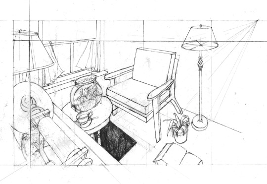
Although it was not obvious in the rough sketches I made, the different props ended up appearing very cramped in the final drawing, so the fishbowl did not appear as the focus of the shot. I would have to consider when working on the final hand in's line drawing component.
The third tutorial was for the drawing practice which involves outdoor compositions. For environments consisting of organic forms, finding the horizon line is important when drawing them and take note that the large land masses are still on the ground. For this practice, we had to draw an image of a forest given in another camera angle.
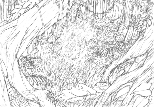
For this drawing, I started with the closer trees as a frame then struggled when working on details such as the grass and weeds. I should have controlled the number of details in different areas of the shot to lead to eyes to the centre of the image.
Lastly, to make the settings appear more charming to the audience, our tutor explained ways to make the backgrounds look more captivating rather than informational. To do so, the advice given is to have solid perspective drawing and to research on details, as well as to vary line weight to create a sense of depth. I realised after this tutorial that many of my previous perspective drawings have this issue as the ones with many geometric forms appear too mechanical. As such, I tried following the guidelines given when working on the line drawing, then cleaned it digitally for the final hand in.

The second part of this unit was the 3d component and it began with an introduction to blender. For the next 3d tutorials throughout the unit, we were guided on how to model a realistic eyeball which will then be used for the final 3d render. I tried using blender a few times in the past but struggled a lot because I was not sure how the different tools work. These tutorials helped to familiarise me with several functions that are used often in modelling, such as proportional editing and extrusion. The types of texture maps used were explained clearly and this later helped me a lot when creating my own materials.

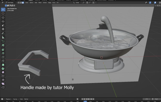
For the “Eyeball Soup” project, I wanted to create a scene which depicts a cannibalistic family having a hotpot dinner. The inspiration of this came from various horror games which have this storyline as a reason for body parts to be found in meals. I also wanted to play with the cultural aspect of this project as I find the many ways to incorporate this grotesque subject matter into Chinese superstitions to be interesting to research on.
The first items I modelled besides the eyeball are simple items such as bowls, plates, and trays, then working on more complex objects like the hotpot. While they are all made of similar shapes, I struggled a lot with modelling the bottom half of the hotpot as I was still not familiar with using the extrusion and other editing tools. I had to redo the modelling several times before ending up with this result.

The handle was also challenging to model. The use of the mirror and subdivision surface modifiers made it difficult to bevel the edges of the handle. I decided to try working on other parts first, so I started looking up fluid simulation tutorials for the soup broth. I wanted to use a fluid simulation for this as I wanted the soup to appear as if it was boiling.

On a separate blender files, I began to model the mahjong table and food items that I want to include in the scene.
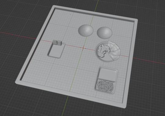
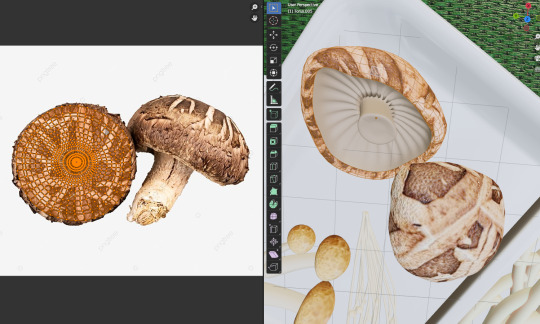
For tubular forms such as the organs and noodles, I used the Beizer curve tool to make the process more efficient. While the noodles were made without textures, I struggled to map out the texture for the organs. I ended up using the “Project from view” function to make the texture appear less out of place.

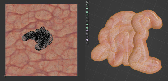
For more complicated organic forms such as lettuce leaves, I followed a tutorial to learn how to create believable folds using sculpt mode. By adjusting the radius and origin offset of the boundary forms, I was able to create a shape that resembles the references I used.

UV mapping was more challenging as I had to fit the mesh into the image texture.

After a while, I was able to familiarise myself with modelling objects and adding textures. The key issues I had were still the accuracy of the models and the quality of the textures I used. Although the image quality was not obvious in this project, I would have to consider this in the future when modelling items that require close-up shots.
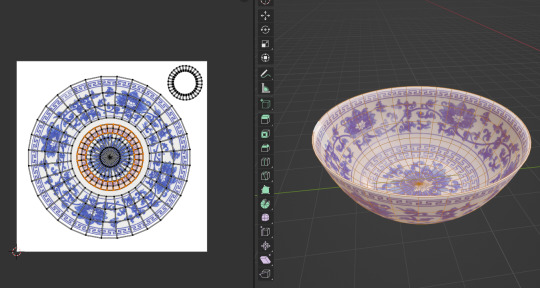
I also wanted to add a rice bowl with chopsticks sticking into it as this act is seen as a major taboo across Asian countries, since it resembles incense used in funerals and offerings. To create the rice, I followed a rice modelling tutorial and adjusted the amount of rice on the sphere.

A tedious step I had to do was to split the fluid domain in half. I ended up needing to redo the fluid simulation twice on two separate “bowls” in the hotpot. While it was very time consuming, I was still thankfully able to finish it in time and converted the domains to mesh for the material setup. I also added a few planes with newspaper as textures as it is common to use newspapers to prevent broth from spilling onto the table.
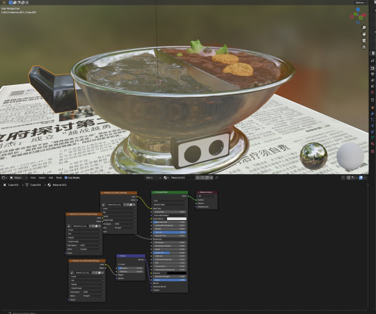
For extra detail, I also added text into the switch panel and added small spheres which emit red light.
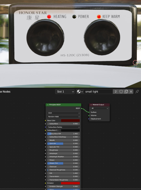
The handle was also fixed with more precise use of the bevel tool.

After a while, I was finally able to finish modelling all the objects and adding textures onto them, then appended them together into one blender file.

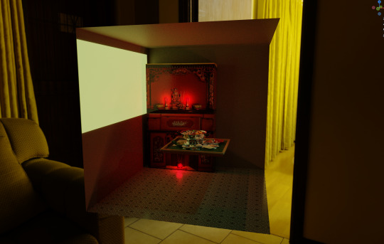
Afterwards, I modelled parts of the room that are visible in the shot and added lighting to the scene. I used a tile pattern for the floor and added a “window” which emits light. The altar was an image UV mapped into a cuboid as I had no time to model the entire thing but added some lights and roughness map to make it look more believable.

The last step was to set up the HDRI and adjust the rendering settings for the final render. The alternative angles and close-up shots I chose for the final submission are in the file uploaded to Moodle.
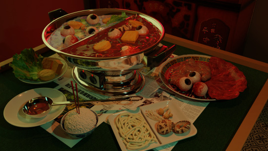
Overall, I was satisfied with the result as I managed to work outside of my comfort zone for this unit. I would like to use what I learned in the 2d component to have a stronger foundation in perspective drawing and hope to learn more about blender and 3d modelling for future projects.
0 notes